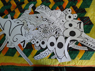
The professor likes these lines
Due next Tuesday!
Broke down and sketched
So much for intuition
Naming it "Cellular Strands"
Too many lines, Not enough!
Trying to be Jean Arp.
If all else fails,
Make it look like a plant.
Perhaps it's scale!
Let's redraw all these lines.
Committed to dots and circles.
Does it look good or bad!?
Text an artist friend
"It's too detailed, they like minimal"
Reject pile's gotten huge
I think I'm on to some thing here...
What if I did this?
Dots ARE too complex,
Give up, go to plan B
Scribbly not-arabic.
Flip it around front to back,
Add this, subtract that,
Artist friend approves.
Oh God I like it horizontal,
She likes it vertical,
Either way it's "Butterfly" now.
Four people approve,
Only one majors in art.
Pretty pretty presentation,
It's done!


No comments:
Post a Comment